
Inland Marine Policy Change Transformation
Streamlining complex policy changes for faster agent and underwriter workflows at West Bend Insurance Company.
Timeline
July – October 2025
Role
UX Researcher & Designer
Context & Challenge
PCT, or Policy Change Transformation, is when a policyholder asks an agent or an agent asks West Bend to make some change in the policy. Some of these are premium bearing changes, some of them aren't. Before this project, West Bend took about 8 days to get processed on average, which can be pretty frustrating when it's something as simple as just like changing a vehicle, a name, or an address.
The UX Design Team’s participation in West Bend’s Policy Change Transformation initiative aimed to simplify and accelerate how agents and underwriters process policy changes across product types. Within PCT, there are 11 different change types. Inland Marine policies, which cover specialized equipment and property, had some of the most complex workflows.
This redesign focused on improving speed, reducing redundant manual entry, and increasing clarity for both underwriters and agents handling changes like adding equipment, adjusting limits, or managing loss payees
Each policy change could require navigating through 5+ screens and multiple note entries.
-
Each policy change could require navigating through 5+ screens and multiple note entries. -
Research Goals & Methods
The discovery phase centered on identifying:
What slows down Underwriter Techs when processing Inland Marine changes.
How system limitations force extra manual work.
Which specific Inland Marine scenarios or change types introduce the most complexity.
Methods
To gather insights, I conducted a detailed interview with an Underwriter Tech who regularly processes Inland Marine tasks. I also reviewed documented system requirements and business rules provided by the Product Owner to understand the technical scope and compliance needs that would shape the design.
This combined approach of user feedback and business requirements helped identify where usability and system logic needed to align in the new design.
User Interview Highlights
Interviews revealed that most underwriters work within a single product type and feel uncertain during deletions or endorsements because linked loss payees and items aren’t clearly shown. Frequent navigation between screens and manual note-taking outside the system slowed them down, and some required fields added no real value.
Key Insights
Focus on single-type workflows over multi-type switching
Auto-fill notes to replace manual documentation
Clarify loss payee links during deletions
Reduce navigation between queue, notes, and pricing screens
Simplify or automate low-value required fields
“If I remove an item, I can’t tell which Bank of America loss payee it belongs to — I have to click through every record.”

Design Process
Design Approach
The design phase focused on streamlining Inland Marine policy changes to improve speed and accuracy for agents and underwriters. The workflow for adding an ATV to Contractor’s Equipment illustrates how research insights shaped a simpler, more transparent experience across the platform.
Adding an ATV to a Contractor’s Equipment policy highlights complex rules, including high-value thresholds, referral triggers, and linked loss payees. Collaboration with the Senior UX Designer ensured consistent workflows across Inland Marine and vehicle entries, so users wouldn’t have to learn two systems.
Key Challenges
Multi-tab workflow required extra clicks.
Manual note-taking for referral and loss payee tracking
Limited visibility of key data in one screen.
Legacy interface lacked inline validation and adaptive fields.
Design Goals & Constraints
The research phase revealed that underwriter techs were frequently switching between multiple tabs, taking extensive handwritten notes, and relying on memory to track referral rules and linked loss payees. The goal for the redesign was to create a more predictable, guided workflow that reduced the cognitive load and manual steps required in the legacy system.
A first-pass release was required by end of 2025. Loss Payee and Location fields were temporarily replaced with a Notes section to capture underwriter intent, with full integration planned for 2026. The “Other” equipment flow also used a Notes section to handle unique edge-case details.
See below for current Duck Creek Interface!
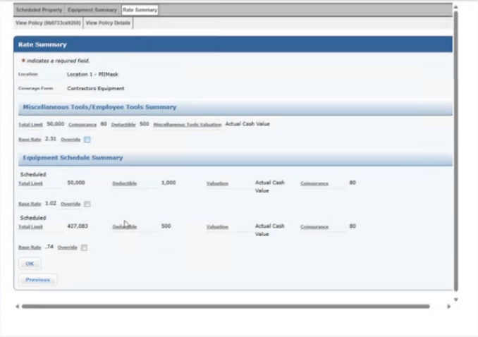
Here you can see the current tabbing section users have to go through to enter new equipment.
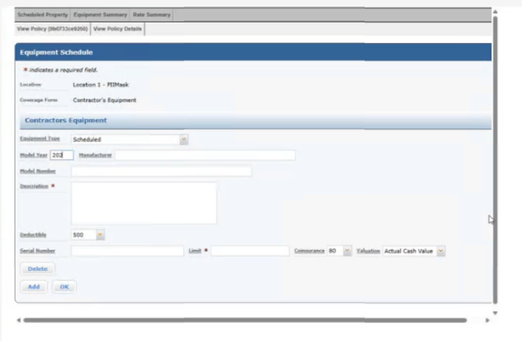
This is the current add equipment page, there's an additional Add Risk Summary page as well that adds more data for the user to enter.
The current system grid, the search features aren't as functional or selective as they could be.
Design Iterations & Process
The design process moved through three structured iterations, each building on research insights and collaboration with the UX team and underwriter tech. Early passes focused on translating the existing Duck Creek workflow into a more guided, modal-based experience without disrupting familiar patterns. Later iterations shifted toward reducing cognitive load, simplifying steps, and preparing the system for phased technical rollout.
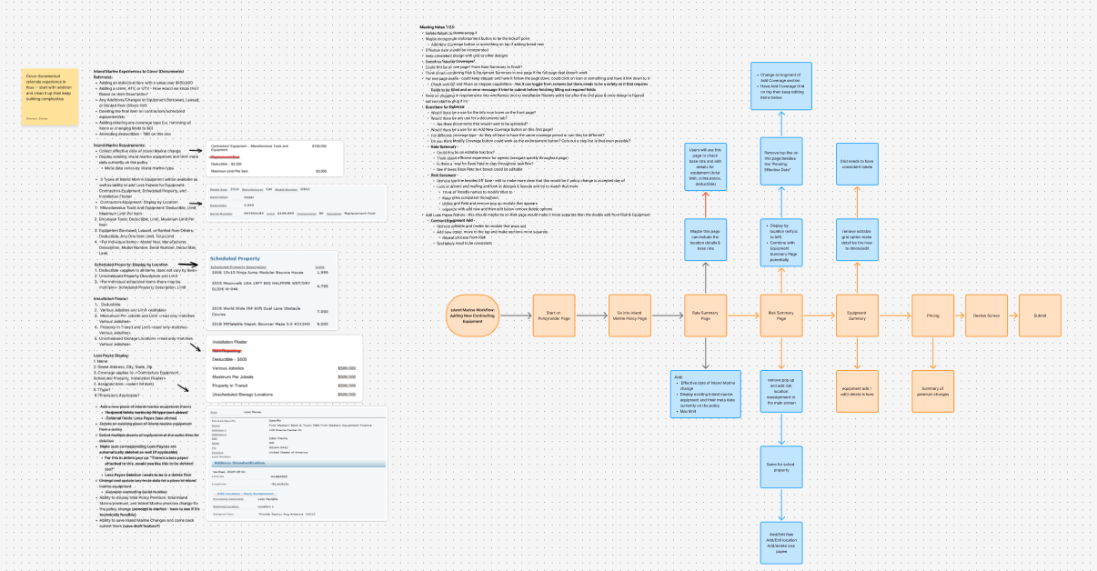
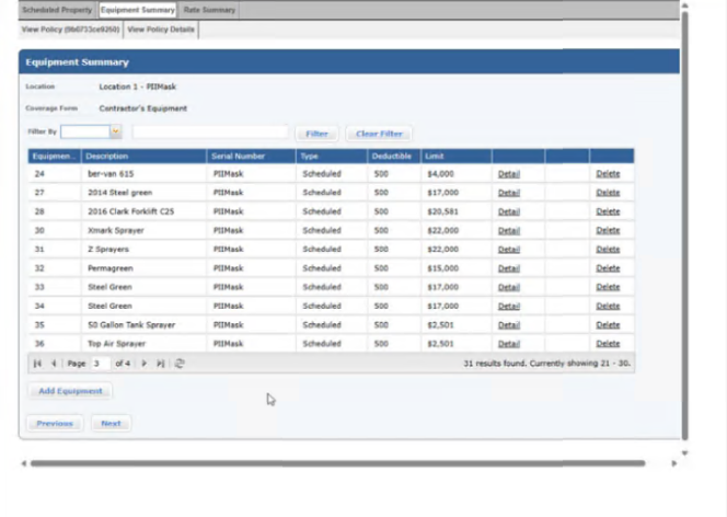
Iteration 1 — Legacy-Aligned Structure
The first iteration closely mirrored the existing Duck Creek workflow. The goal was to map the current experience into the new system so the UX team and underwriter tech could validate required fields, terminology, and logic. This version still relied on multi-tab navigation and grid-heavy layouts, preserving familiarity while establishing a baseline for improvement.
What this visual shows:
Legacy-style tab navigation (Rate Summary → Risk Summary → Equipment Summary → Pricing → Submit).
Equipment listings split into “Existing” and “Scheduled,” requiring multiple screens and mental tracking.
High cognitive load: users must jump between sections to add, edit, or reference equipment details.
No dynamic fields or modal-based workflow yet — additions happen in-page, often requiring scrolling.
Why this iteration mattered:
It established the foundation of required content and field logic before exploring how to streamline the workflow and reduce navigation.
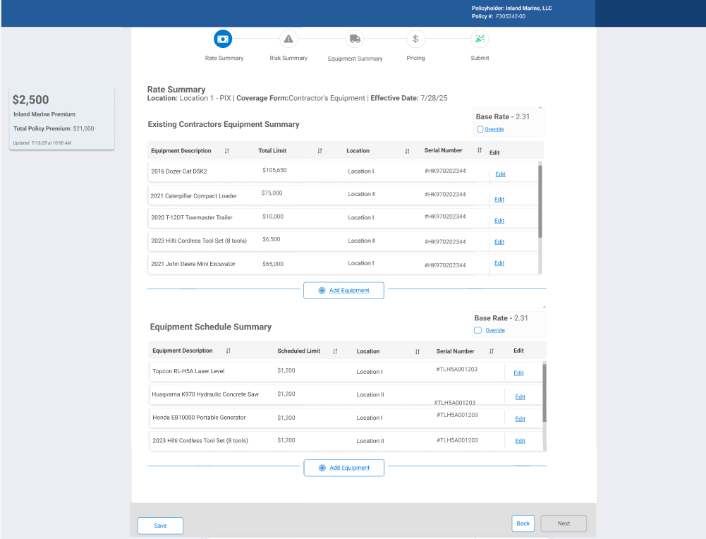
Iteration 2— Streamlined Equipment Workflow
Version 2 focused on decluttering and improving usability based on feedback from the first iteration. It combined the two separate equipment sections into a single summary, added tools for quicker actions, and removed features that were inconsistent with other PCT project variations. The goal was to reduce cognitive load, make key actions more visible, and better align with user expectations.
What this visual shows:
Single Equipment Summary section consolidating “Existing” and “Scheduled” equipment.
Reassign Location button added directly in the grid for faster updates.
Loss Payee and Delete columns added for easier management of critical entries.
Tracker system removed to align with other IM workflows (like Drivers).
Premium pop-up removed from side field and relocated to the end of the process.
Cleaner, more compact layout reduces scrolling and multi-tab navigation.
Why this iteration mattered:
It addressed main pain points from Iteration 1 — making equipment management more intuitive, reducing unnecessary navigation, and surfacing high-priority actions like deleting items or adding loss payees. This set the stage for further process efficiency and visual refinement in Iteration 3.
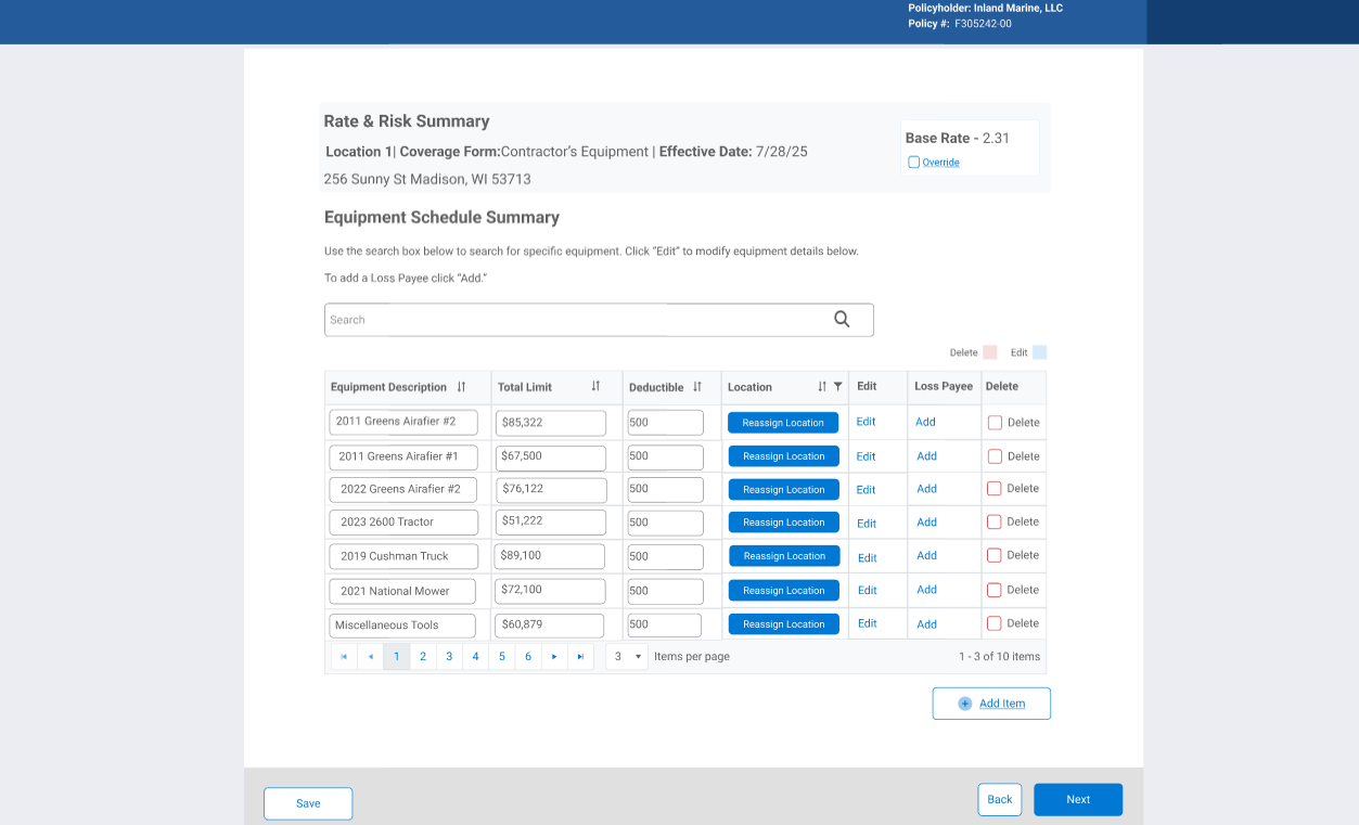
Iteration 3— Optimized Equipment Management
Version 3 further refined the equipment workflow to balance clarity, flexibility, and searchability. It separates the “add new” and “edit existing” sections while enhancing the grid to support more structured and searchable data. This iteration prioritized reducing errors, improving discoverability, and accommodating different agent input habits.
What this visual shows:
New Equipment section added at the top of the page, separating adding new items from editing existing equipment.
Location column moved to the start of the grid for quick reference.
Additional searchable fields introduced, including Serial Number, Year, Manufacturer, and Model.
Grid cells no longer editable inline — users make changes through an edit modal, ensuring consistency and validation.
Equipment description split into Year, Manufacturer, and Model to standardize input while still allowing agents to enter full descriptions in a modal if preferred.
Grid updates display all equipment consistently, regardless of how data was entered, reducing errors and maintaining flexibility.
Why this iteration mattered:
It enhanced usability for both new and existing equipment, improved search and sorting capabilities, and addressed inconsistencies in agent data entry. This iteration maximized efficiency while supporting varied user workflows, making the equipment experience both structured and flexible.
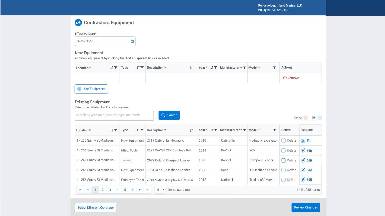
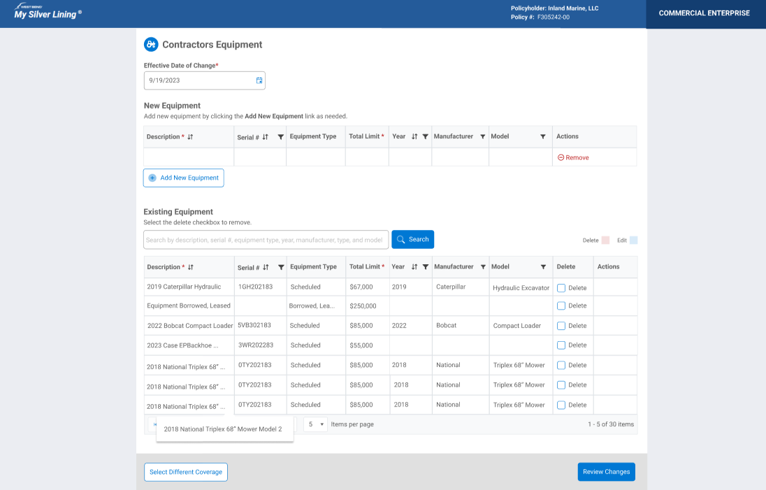
Final Version — Production-Ready Workflow
The final version built on V3 with subtle refinements to maximize clarity, space efficiency, and usability. It maintains the structured workflow while optimizing grid display and modal interactions, ensuring agents can access all necessary information quickly and consistently.
What this visual shows:
Separate sections for adding new equipment and editing existing items remain.
Location column removed from the grid — all location data is managed in the modal, freeing space for other critical information like Equipment Type.
Grid cells remain non-editable inline — all changes occur in the edit modal for consistency.
Hover feature added to display full equipment description when content does not fully fit in the cell.
Effective Date section retained at the top of the screen for entries added to the policy on dates other than the current day.
Why this iteration mattered:
It optimized space, clarified workflow, and reduced errors while maintaining flexibility for agent input. The final design delivers a clean, intuitive, and production-ready equipment management experience.
Final Inland Marine Workflow
Final Design Decisions:
For the final version of the Inland Marine equipment workflow, this walkthrough demonstrates the fully refined end-to-end experience. The video shows the completed interaction model in motion, while the steps below highlight key design decisions and why they matter.
Workflow Highlights (Paired with Video)
1. Agent Dashboard → Policy Entry
Entry point shows all policy change options in one place. Selecting Inland Marine Equipment reinforces consistency with other change types like drivers and vehicles.
2. Coverage Categories & Actions
Coverage categories (Contractors Equipment, Installation Floater, Scheduled Property Floater) are separated from actions. This supports faster scanning and reduces selection errors.
3. Contractors Equipment Main Screen
The Effective Date of Change leads the page to reinforce real-world policy timing. New vs. Existing Equipment sections are clearly separated to reduce cognitive load.
4. Add New Equipment Modal
Structured fields (Type, Serial, Limits, Year, Manufacturer, Model) support clean data, while the optional Description field preserves agent flexibility.
5. Notes as a Flexible Placeholder
Notes temporarily capture location, loss payee, and additional interest to allow early rollout without blocking core functionality.
6. Explicit Delete with Undo & Review
Delete requires confirmation through Review Changes to prevent accidental loss. This directly resolved a high-risk pain point from Iteration 2.
7. Review Changes as a Safety Net
All adds, edits, and deletions are confirmed in one place before submission.
8. Platform Processing & Expectations
Duck Creek processing feedback is shown to set expectations and reduce uncertainty.
9. Submission Confirmation
Final confirmation reinforces completion and underwriter handoff.
Learnings & Takeaways
Launching the first-pass design on schedule demonstrated how to balance user needs, enterprise rules, and project constraints. Collaboration with the Senior UX Designer reinforced the importance of cross-workflow consistency. The design lays the foundation for future enhancements while immediately improving usability and efficiency for underwriters.