

Virtual Park Ranger Capstone
As someone who loves National Parks, I initially found navigating the websites while planning my trips challenging. This inspired me to dig deeper and explore how the experience could be improved to help first-time users plan their visits more easily.
Role
UX Researcher & Designer
Year
2024-2025
Intro to the Problem
Since the pandemic, National Park visitation has surged, increasing by 4% in 2022 alone.
This growth reflects a renewed interest in exploring nature.
Challenges
Many visitors struggle with outdated, poorly designed websites.
Mt. Rainier’s website, a critical tool for trip planning, fails to meet modern expectations.
Impact
Frustration, accessibility issues, and decreased engagement.
Comparitive Analysis
What are other National Parks doing differently?
I conducted a comparative analysis of two other National Park websites—Yellowstone and Olympic National Park—to identify commonalities and areas where these websites outperform the current Mt. Rainier site. This analysis also allowed me to pinpoint the strengths of Mt. Rainier’s website.
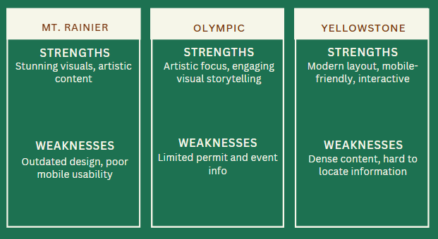
Design Improvements - Simplify the website layout with a modern, mobile-friendly design and updated visuals.
Content Organization - Reorganize key information like permits and trails for easier access with a clear, intuitive structure.
Unique Features - Add engaging tools like virtual tours, artist retreats, or interactive programs to enhance accessibility and appeal.
Mobile Optimization - Ensure seamless usability across devices, following best practices from Yellowstone and Olympic.
By combining these updates with Mt. Rainier's unique artistic content, the redesigned website will improve navigation, usability, and visitor engagement.
Insights & Recommendations
I interviewed a mix of first- and second-time Mt. Rainier visitors to understand how they use the park’s website to plan trips. Most sessions were 30 minutes over Zoom, with one in-person.
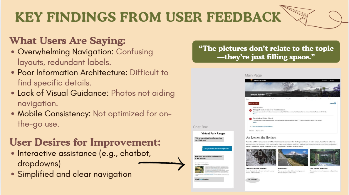
Users consistently said the site felt cluttered and overwhelming. Key info like maps and safety tips was buried in dense text or repeated across pages. The "Things To Do" section, in particular, caused confusion.
Participants wanted a simpler, more visual layout to help them plan quickly and confidently. Many suggested a chatbot for quick answers and clearer page organization to reduce time spent searching.
User Interviews
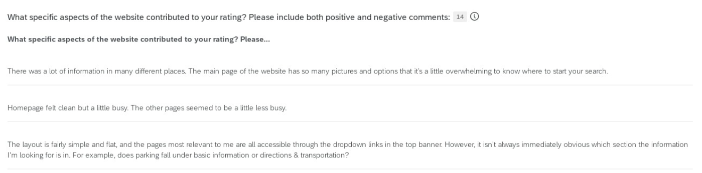
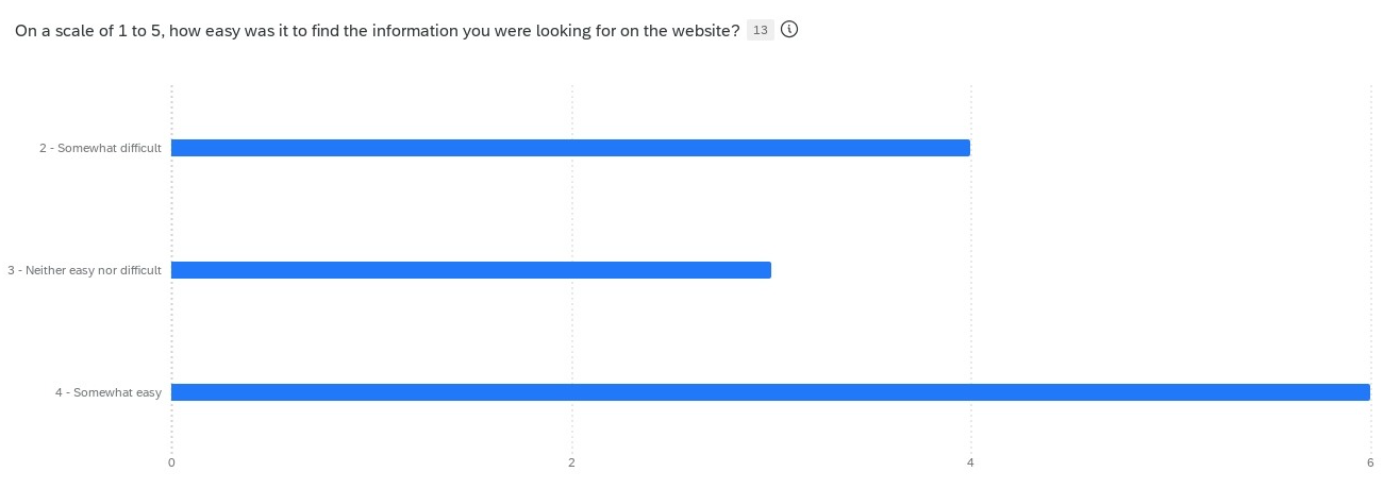
Building on insights from earlier user interviews, I created a survey to better understand common pain points on the Mt. Rainier website. The results showed that while users could usually find the information they needed, the process was slowed by page clutter, unclear categorization, and repeated content. Many also felt the homepage was overwhelming and inconsistent in design, making navigation harder and the site feel less polished than other National Park websites.
A number of newer users specifically expressed interest in having an AI chatbot to quickly surface relevant information and guide them through the site. These findings shaped the redesign focus on simplifying the homepage, improving content structure, adding visual cues, and exploring tools like an AI assistant to make navigation easier.
User Survey

Design Process
Brainstorming
How might we support Mt. Rainier visitors before, during, and after their trips with a clearer, more accessible digital experience?
I started the design process by looking beyond just redesigning the Mt. Rainier website and explored the idea of a companion app for first-time visitors. Research showed that users wanted more advanced tools for planning their trips and help while on the trail, since many struggled with cluttered information, unclear navigation, and not knowing what to expect.
Using FigJam, I brainstormed over 24 ideas with color-coded Post-its and used laddering to map different user needs, from finding key park details and getting weather alerts to improving the overall visitor experience.
In the end, I narrowed it down to three features directly tied to the research: a Virtual Park Ranger chatbot to help newer users find information, a “What to Expect” Visitor’s Guide to simplify trip planning, and Mobile-Friendly Offline Maps for reliable navigation. These concepts aim to make the park experience clearer, safer, and more engaging.
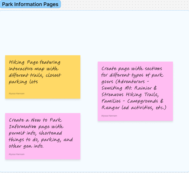

Brainstorming Post-its have been sorted into three main categories: Ranger Led Programs, Online Initiatives, and Park Information Pages.
Storyboard: First-Time Visitor’s Journey
Storyboarding highlighted challenges first-time visitors face when planning a trip to Mt. Rainier, guiding me to focus on the pre-trip experience.
Key Issues:
Overwhelming information
Scattered resources
Uncertainty about safety and logistics
Solution: I created AI Ranger, a chatbot that provides real-time info to simplify trip planning. Future versions could include a mobile app with GPS tips and offline support.
Storyboard lays out a first-time visitor’s journey through planning their trip to Mt. Rainier utilizing the AI Park Ranger.
Wireframes
Taking a step back to review wireframing best practices helped me explore design solutions for the problem statement.
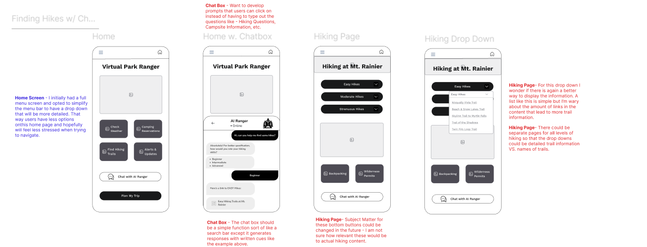
Here's the rough draft that sets it all in motion: a low-fi wireframe with notes mapping the flow of discovering hikes at Mt. Rainier with the AI Ranger.
Focusing on task flows allowed me to refine page layouts for a more streamlined experience. I revisited my paper prototype to adjust page organization and add necessary padding between elements in the wireframe.
Using this paper prototype, I mapped out and fine-tuned the flow for helping users discover hikes at Mt. Rainier with the AI Ranger.
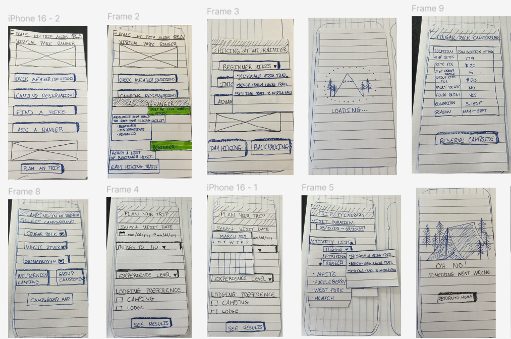
Heuristic Evaluation
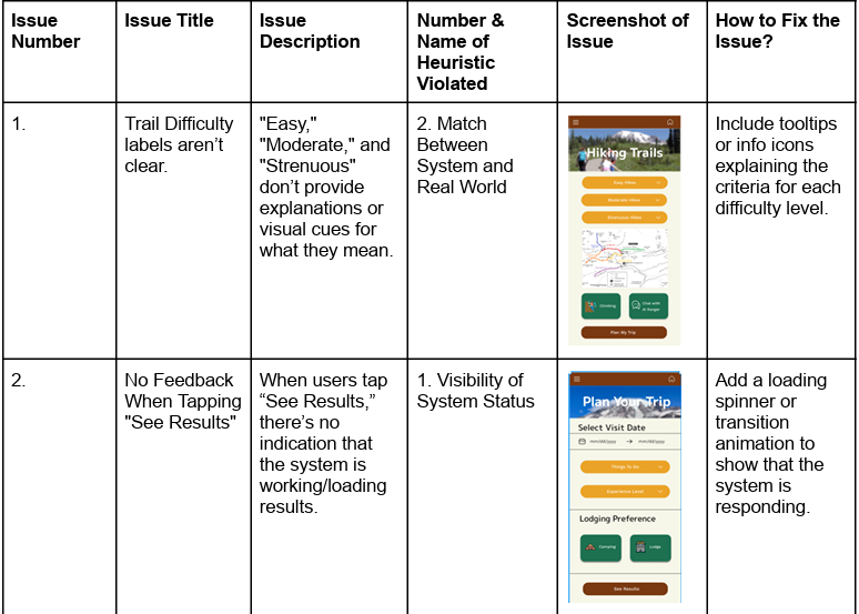
Focused on understanding task flows before critiquing to spot issues.
Noted design changes, especially for the “Plan Your Trip” section, like adding a progress bar.
Clarified trail difficulty language to improve user understanding.
Added a loading screen to show progress during tasks.

High Fidelity Mockups
Final Design Decisions:
Based on insights from user interviews, the redesign addresses three main issues: overwhelming navigation, a poor mobile experience, and lack of visual clarity.
Clarifying trail difficulty: Added an info icon to the hiking trail difficulty section to help users understand ratings and reduce confusion from unclear content.
Streamlined trip planning: Split the “Plan Your Trip” process into separate screens with a progress bar and back arrows, creating clearer pathways for key tasks like acquiring permits and tracking trip steps.
Camping reservation clarity: Added a pop-up to notify users when they leave the app to reserve a campground, addressing navigation uncertainty and improving mobile usability.
Flexible itineraries: Allowed trip details to be modified on the itinerary page, supporting users whose plans change and improving task completion on mobile.
Guided support: Included AI chat prompts to assist newer users in finding information, helping them navigate the site more efficiently and reducing frustration from overwhelming or unclear layouts.
These screenshots show off the final draft of the Virtual Park Ranger App screens, ready to guide the way!
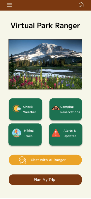
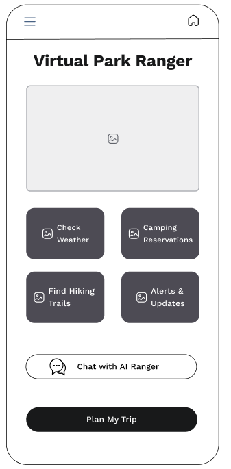
The home page of the AI Ranger App has clearly designated buttons with intuitive icons aiding in their search.
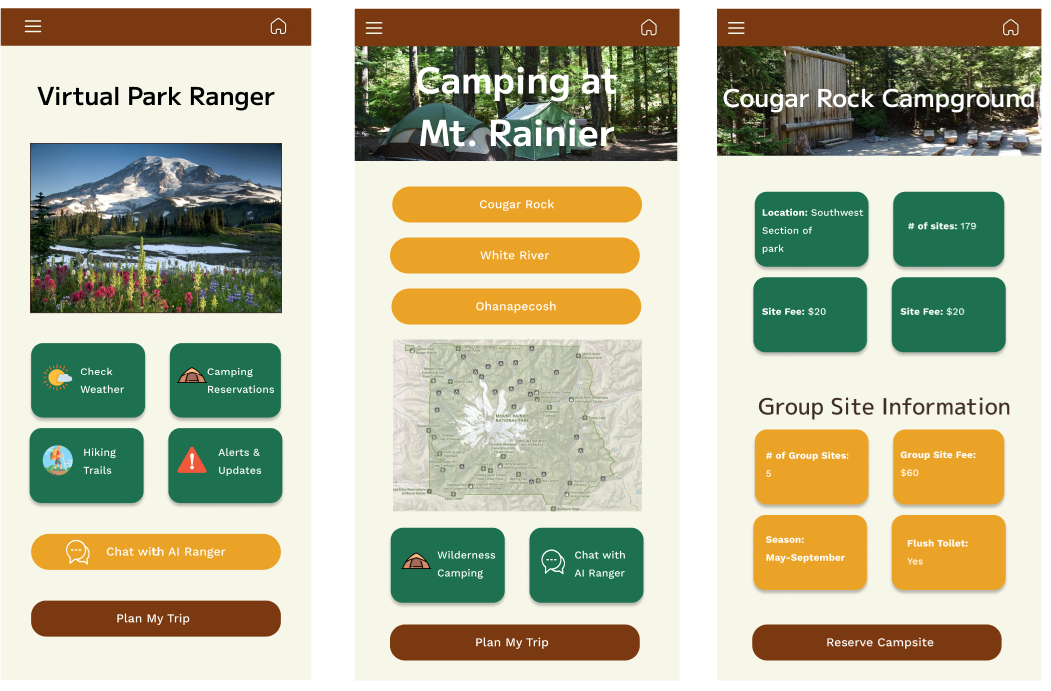
The Camping at Mt. Rainier page breaks down the different campgrounds in the park with a map to help provide a visual cue to users.
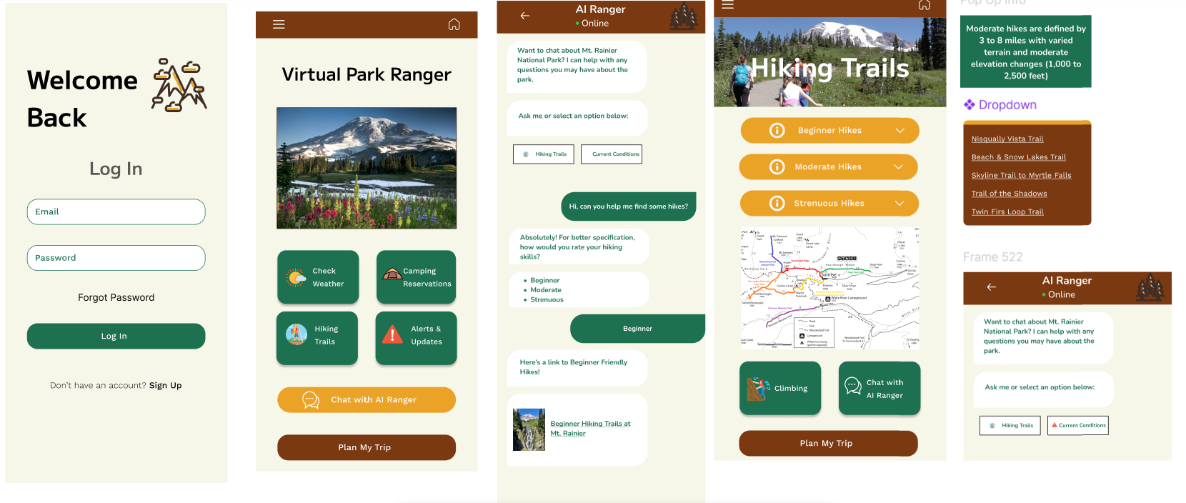
This shows how users can use the AI Ranger to guide them through planning their trip, utilizing prompts in a chatbot format.
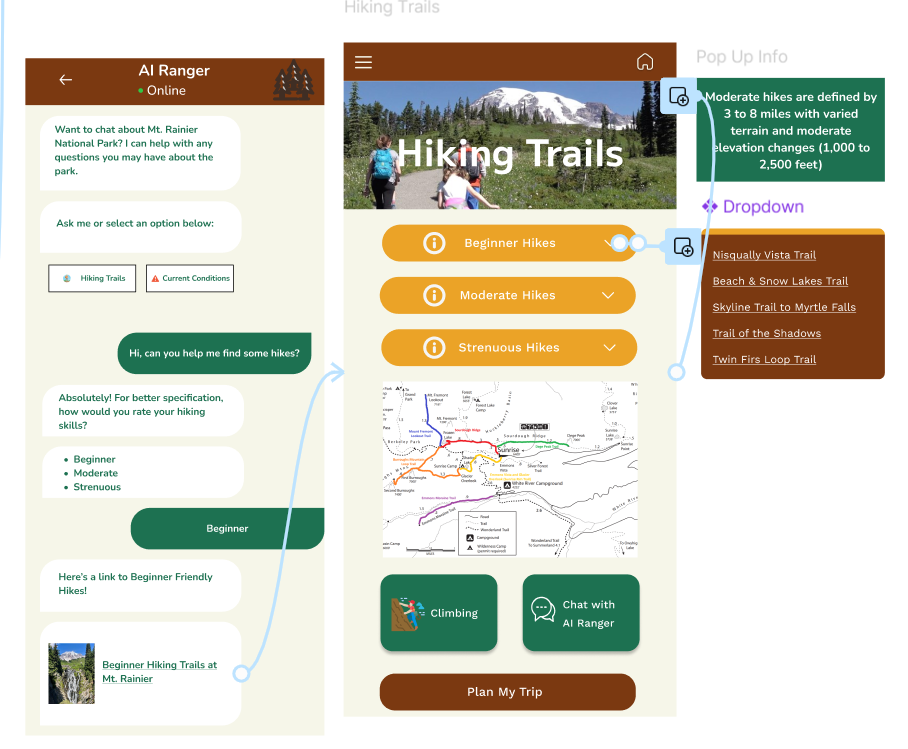
This shows in detail how the AI Ranger works.
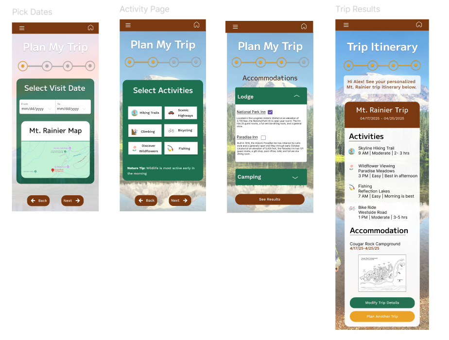
Shows how the trip planning process works within the app and the itemized itinerary created from the users choices.
Learnings & Takeaways
This project was a great learning experience. At first, I struggled to define the vision, especially with the Plan Your Trip section. Paper prototypes played a huge role in figuring out the flow. Sketching allowed me to be messy and free, which helped me refine the experience once I moved to the digital version. Through user feedback, I realized the app would be most valuable to those who had never visited a National Park. They saw how much it would help with trip planning. Experienced park-goers liked the AI feature, but didn’t feel it was essential for their own planning. Working through these iterations, I was able to finalize the flow with a user-centered focus.